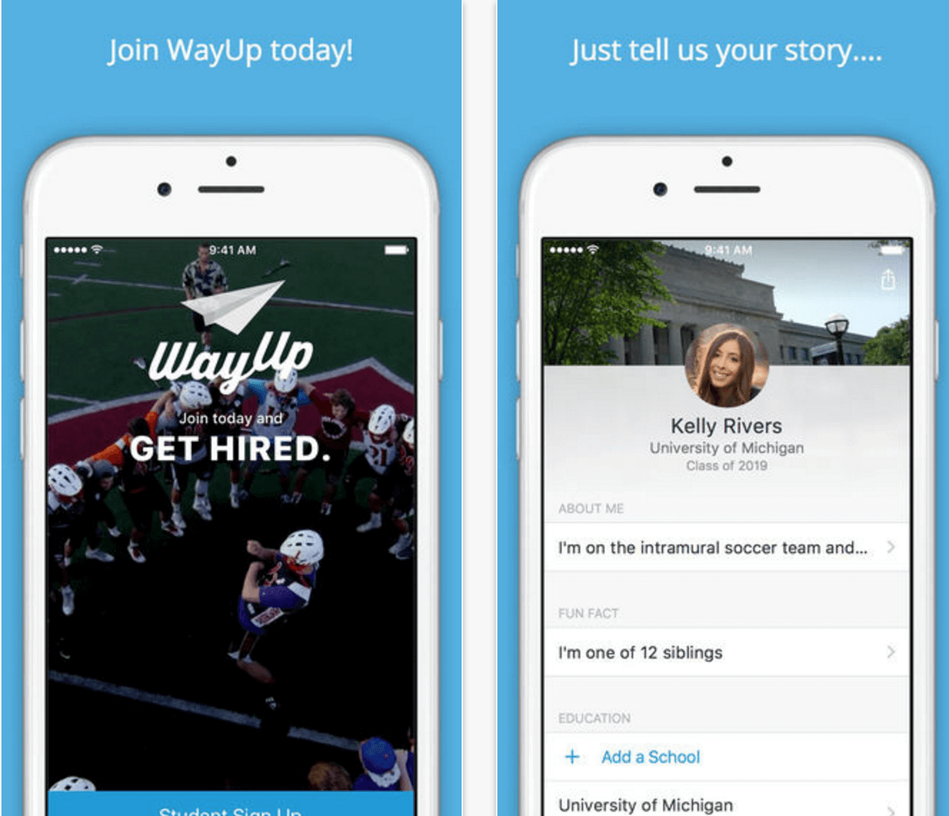
Building your first app is never an easy thing. Three months ago, we embarked on building a native iOS app (written in Swift 2.0) for WayUp, the largest marketplace for college students to find employment. We started with a clean slate: no process, no code, and a brand new team (1 designer, 2 engineers, and 1 product manager). After defined some guiding principles, we bought into them and went to work. The result: this week, our app was accepted by Apple on the first try.
 The following are some of the tips and tricks that we used to make us successful. Hopefully, they will work for you as well!
Identify and perfect the bare necessities.
The app’s features and functionality were deliberately and thoughtfully chosen. We didn’t want to have a bloated MVP, so we built the app to address only the most critical pieces of the job application process. There is no message center yet, there is no career advice (though keep an eye out for those features in the future!). We wanted to keep it simple and give our students what they need – JOBS.
Our app consists of the following major pieces of functionality:
- Registration and Login – We learn all about you during sign up so that we can show you only the best and most relevant jobs
- Job Application – We have a lot of great jobs in our system, so we had to come up with a process that was intuitive and easy to use
- User Profile – Life changes and so does your profile. There needed to be a portion of the app where our students can go to and update their information
- Settings – Every good app allows users to modify things like push notifications so that the experience is personalized and tailored to the user
- Traceability – We wanted to layer in analytics into our app so that we could always be measuring and improving our app from the get-go
We knew that the first two items above (Registration/Login and Job Application) were crucial to the app. We wanted our users to have a good first impression of the app; that meant we wanted to make it super easy to sign up and create an experience that was delightful to the user. In order to do this, we wanted to make sure that we left time to iterate on the signup and job application process. It was crucial that we nailed that and didn’t leave it until the end.
Establish a process that plays to your strengths
“We are going to be agile!” I always love that phrase: usually it’s muttered by people who haven’t really run development teams before. For us, agile, waterfall, scrum, kanban, extreme programming, none of it really mattered. What was important was that we established a process that allowed us to do the following:
- Get feedback from our users early
- Iterate on the most important pieces of functionality
- Make sure what we are building is extensible
- Have a sound testing strategy
- Minimize waste
In a team of people with distinct skill sets, it’s easy to get into the “it’s not my job” mentality. We avoided that by being completely transparent with the codebase, Sketch files, and Pivotal Tracker project. Anyone could file a bug and propose changes, anyone could modify and export design assets, and anyone could modify the codebase and make builds. This allowed the team to work faster, teach each other new skills, and (more importantly) build trust in one another. We developed a workflow that roughly looked like this:
- Design would prototype and validate functionality
- Engineering would build functionality in small, bite-sized chunks so that we were testing the product as it came to life
- Engineering would deliver functionality to the team
- Product would test
- Product would code in the analytics and adjust copy and other functionality as necessary
- Design would adjust storyboards, animations and ensure that everything was pixel-perfect
Once these steps were complete we considered functionality “done” and would deliver a canary build to the company. After establishing this workflow, our goal was to deploy to the canary channel at least once a week and flow that feedback right back into the product, which we did. We delivered 8 builds internally to the company before we submitted the final app for review.
Mitigate your risk
Our process helped us inherently be risk averse:
- We tested early and often so that we avoided succumbing to technical debt
- We cut features that didn’t make sense for an initial launch and iterated on the most important functionality
- We used an internal canary channel to get feedback on the product and also surface edge case bugs
- We all read the Apple Store Review Guidelines…100 times. There are 196 “rules” that Apple can ding you for. We all wanted to make sure that we understood the risks and always had a plan B
- We got creative with our test accounts which got Apple’s attention – you should too! (Our test account was Rocky Clarke from UC Berkeley. Google it if you don’t know the story.)
People all too often fall into the trap of defining too much functionality and allowing apps to become overwhelming, so keep your first version simple and make sure you have a good testing strategy that allows for time to iterate. Most importantly, build a culture around the app. Even if you follow some of the suggestions laid out above, you still need your team to put in the time to build, test, and refine countless times before you get it right.
Good luck!


